One codebase, two faces
How I built a theming system for HyperDX that keeps open-source users happy and ClickHouse Cloud consistent. A designer, AI, and a tight timeline.
Meta moment: this post was written with the help of Cursor and Claude. Practicing what I preach. 🤷♀️
I'm a designer who codes. At ClickHouse, I built a theming system on my own, on a tight timeline, with AI doing most of the implementation work. Here's how.
The problem
I joined ClickHouse as a Senior Product Designer on the HyperDX team in late August 2025. ClickHouse acquired HyperDX earlier that year, an open-source observability platform (logs, traces, metrics, session replay) built on ClickHouse from day one. The plan was to bring it into Cloud as ClickStack.
No design system, no shared conventions, no Figma files. A working product with two identities to serve:
- HyperDX is open source. Its brand is part of what makes it appealing. Make it look corporate, and open-source users aren't going to be happy.
- ClickHouse Cloud needs consistency. Products inside it should feel like they belong there.
I needed both to coexist in the same codebase.
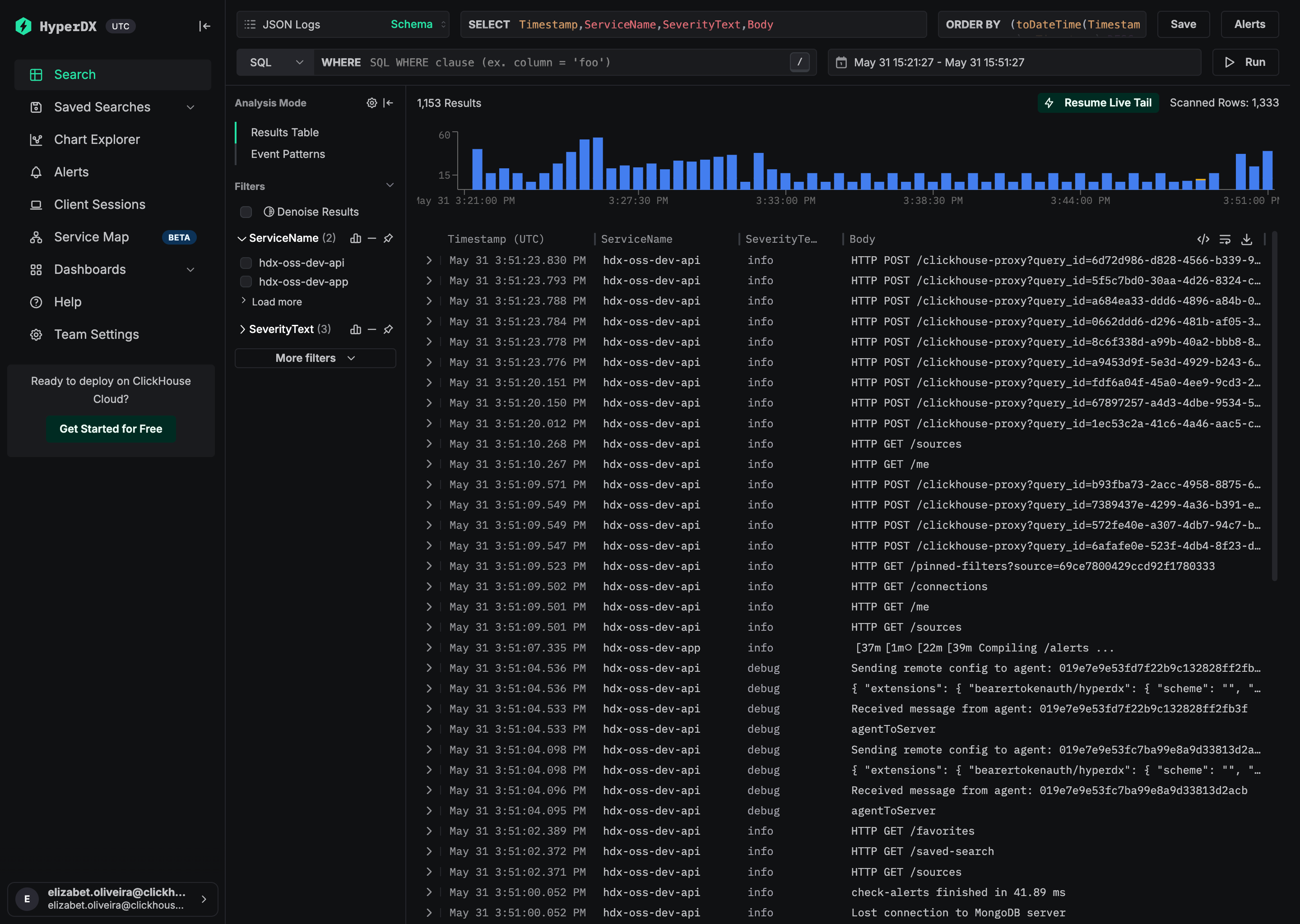
This is what HyperDX looked like when I joined:
The constraint
This was also a codebase problem.
HyperDX used Bootstrap and Mantine. And dark mode? It was a single CSS filter on the entire page:
This inverted every pixel. Images, icons, brand colors, all distorted. No tokens to fine-tune. Third-party components rendered wrong. It worked as a quick hack, but you can't build a theme system on top of a global invert filter.
So that had to go. I replaced it with actual semantic tokens powered by Mantine's theming (53 commits, 98 files, one big bandaid rip). That PR also removed Bootstrap entirely.
Click UI, our internal design system, wasn't ready to replace Mantine. Next.js support was broken (fixed January 2026), and it used styled-components (runtime CSS-in-JS, SSR conflicts, poor tree-shaking). We kicked off a migration to CSS modules, but that's still in progress.
Two options: wait for Click UI, or build something now that won't block us later.
I went with the second. The semantic tokens I'd introduced gave every component a single source of truth for colors. Before, every developer was picking their own values. Need a danger button? Manually pass color="red" and pick whatever variant. The tokens also prepare us for Click UI — the day we migrate, we swap one library for another. In theory.
We already had agent docs in the repo, referenced from CLAUDE.md. I added files with component and styling conventions. They work like a style guide that doesn't get ignored: AI agents read them and flag violations in every PR. I stopped catching hard-coded hex colors in review because the agents do it for me now. All of this made theming possible later.
The "what if" moment
I needed to understand the full picture. How does HyperDX become part of ClickHouse Cloud? Not just visually, the entire user journey.
I mapped it in Figma: from private preview (a button in Cloud that opens HyperDX) to the final state where every page lives inside ClickHouse.
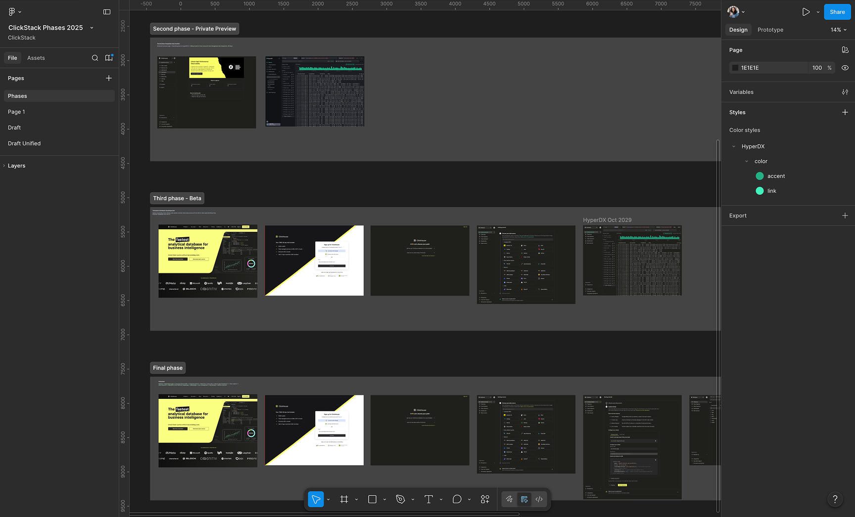
Initially: ClickStack would just look like HyperDX. Fine for private preview. But as I mapped the later phases, where ClickStack lives inside Cloud with shared navigation, the HyperDX brand would feel disconnected from everything around it.
What if the codebase supported two themes? HyperDX brand for open source, a second theme for the managed experience that matches Cloud. Same codebase, two faces. Each deployment picks its brand at build time.
HyperDX open-source theme vs. ClickStack managed theme:
Building the theme system
The engineering team was focused on shipping features, and this was a design-led initiative. I could have waited for bandwidth, but AI tools had gotten good enough by late 2025 that I decided to build it myself. Cursor with Claude.
I brought the problem to Claude. Something like: "Two brands sharing a codebase. In production, the brand should be locked by an env var. In dev, I want a toggle to switch without redeploying. Set up the provider shell." I didn't need to know Next.js boilerplate or how to wire up a React context. I just described what I wanted and iterated on what came back.
Two independent concepts: a brand theme (hyperdx or clickstack) controlled by the deployment, and a color mode (light/dark/system) controlled by the user.
Brand resolution:
- At build time,
NEXT_PUBLIC_THEMEdetermines the brand. The server puts atheme-hyperdxortheme-clickstackclass on<html>. - In dev, you can override via
localStorageor a UI toggle in preferences. - In production, the brand is locked.
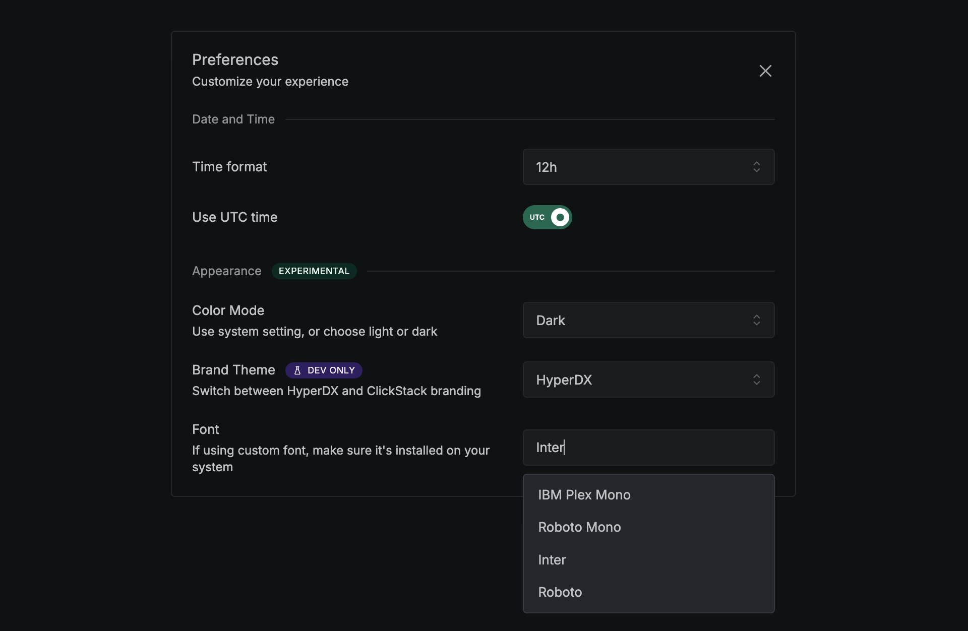
We staged the preferences panel so developers can switch themes and color modes without redeploying:
Each brand defines semantic CSS variables scoped to .theme-{brand}[data-mantine-color-scheme='{mode}'] selectors (2 brands × 2 modes = four blocks). Components use var(--color-bg-surface) and the right value resolves automatically.
I built the theme architecture with Claude: a ThemeProvider with hooks (useAppTheme(), useWordmark(), useLogomark()), a Zod-validated registry that catches broken configs at load time, and an SSR-safe script that sets color mode before React hydrates (no flash). A fallback layer (_base-tokens.scss) covers the brief window before the theme class applies, defaulting to HyperDX tokens.
Each ThemeConfig is validated with Zod: brand name, CSS class, Mantine overrides, logos, favicons. If something's wrong, the app throws in production and warns in dev.
ClickStack pulls in Click UI's design tokens (--click-global-color-*) as an intermediate layer. HyperDX keeps its green (#00c28a), ClickStack uses yellow (#faff69) for buttons in dark mode and near-black (#302e32) in light. Different fonts too: HyperDX lets users pick, ClickStack locks to Inter. Both themes share the same set of semantic vars, so adding a new one means updating all four SCSS blocks (2 brands × 2 modes).
I also wrote a themes agent doc: never hard-code hex colors, never branch on themeName for colors (CSS vars already resolve), never confuse IS_CLICKHOUSE_BUILD with theming.
I didn't memorize Zod schemas or hydration quirks. I understood what I needed: "the app should know its color mode before the first paint." Claude turned that into code. I decided which tokens map where, color relationships, typography. Claude handled the wiring.
Both themes support light and dark mode. Here's HyperDX with its green palette:
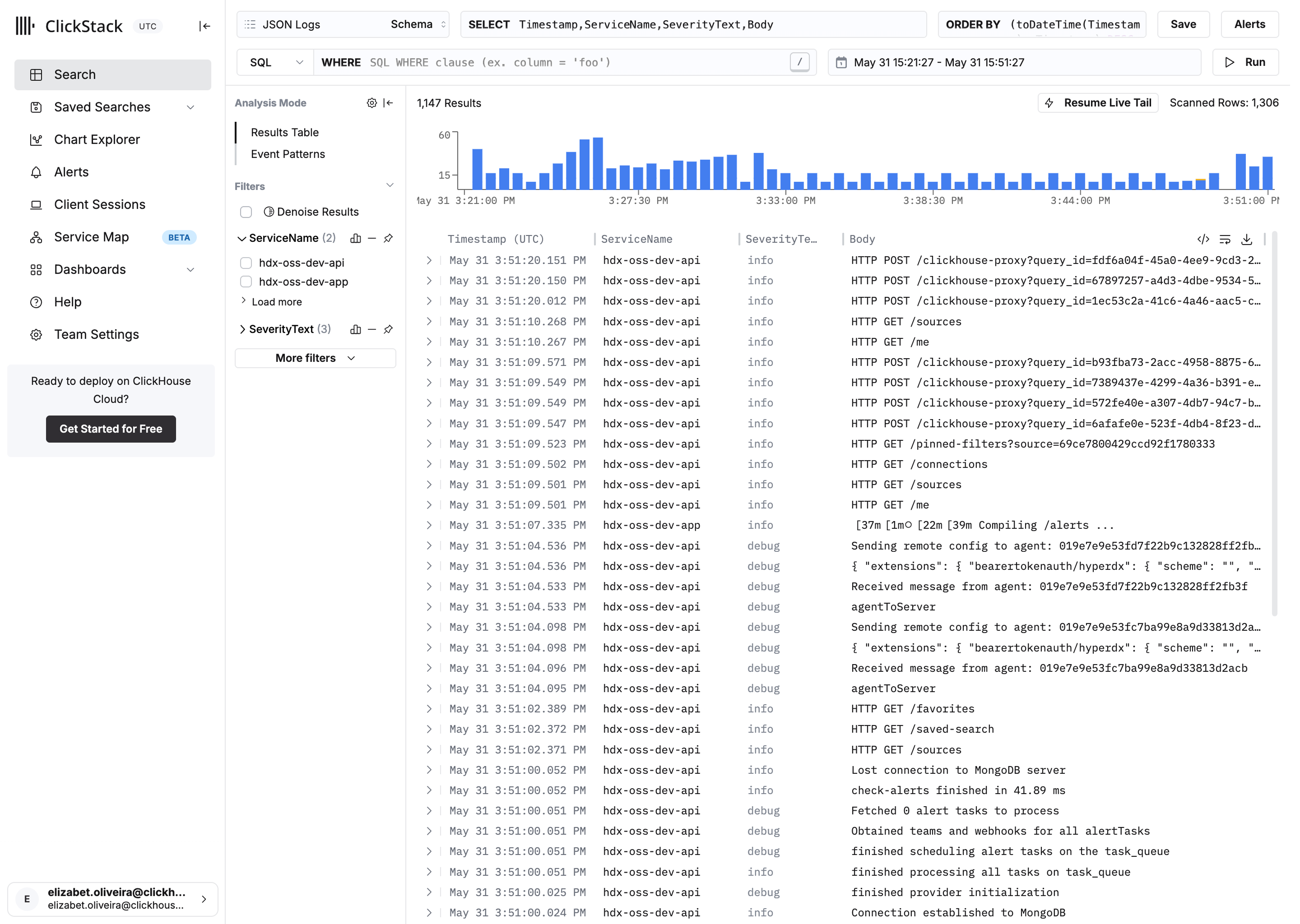
ClickStack, same UI, different brand. Yellow accent in dark, near-black in light, Inter font, Click UI tokens:

Making ClickStack feel like home
A user coming from ClickHouse Cloud and landing in ClickStack shouldn't feel like they left. Different design systems under the hood (Mantine vs. Click UI), same family on the surface.
I matched color tokens so backgrounds and borders land in the same range. Adjusted the Tabler icon stroke weight to match Click UI's thinner style. Aligned the sidenav spacing and active states to Cloud's navigation so the muscle memory carries over.
ClickStack and ClickHouse Cloud side by side:
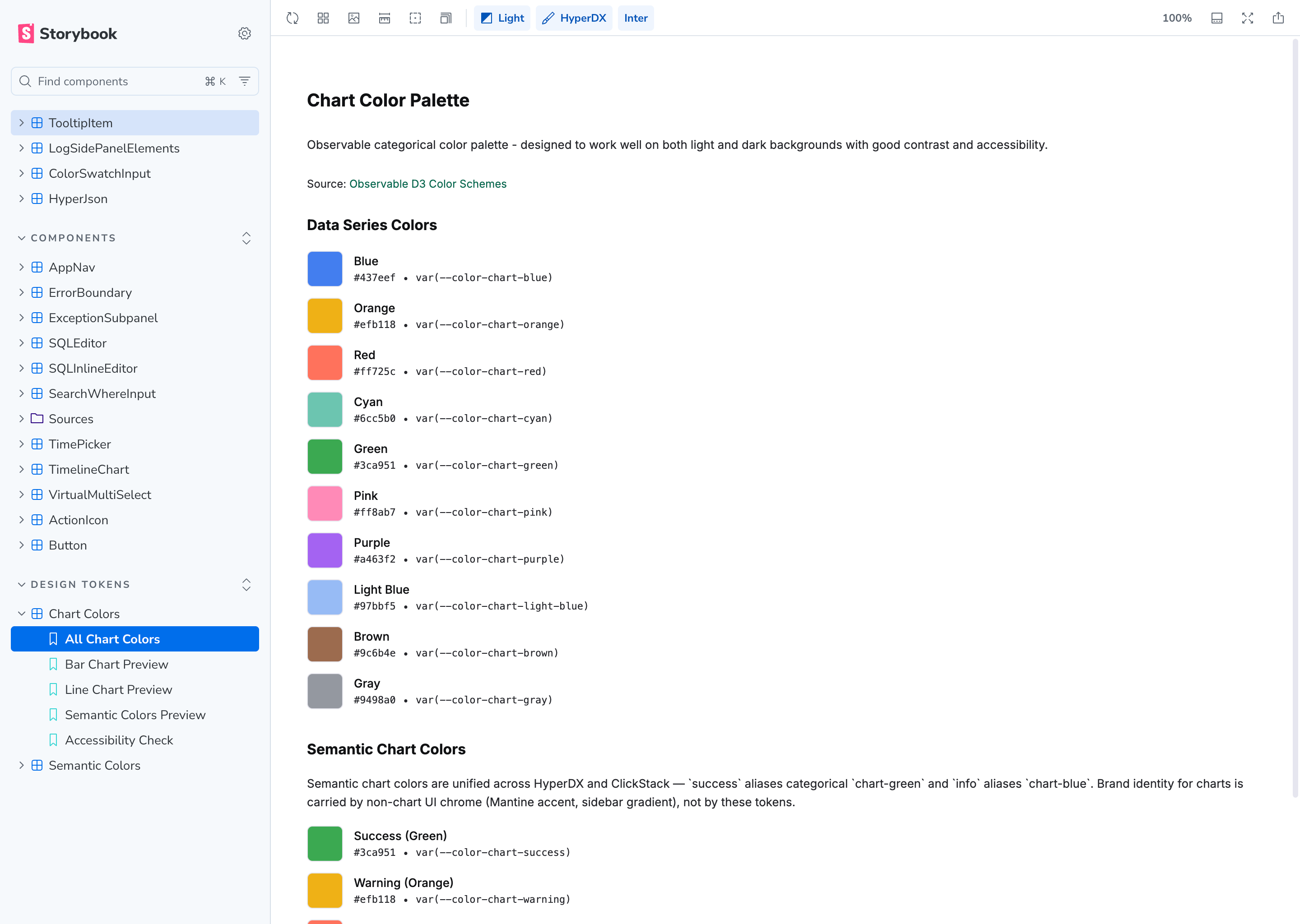
Unifying chart colors
Both themes share the same categorical chart palette. I adopted Observable's categorical palette, shifting the blue to match ClickHouse's brand.
The UI chrome (accent colors, sidebar, logos) already differentiates brands. Charts don't need to. So I mapped semantic vars straight to categorical hues: success is chart-green (#3ca951), info is chart-blue (#437eef). Same on both brands.
Documenting tokens in Storybook
The token set was growing and the only way to know what existed was to read SCSS files. We set up Storybook to render all tokens visually.
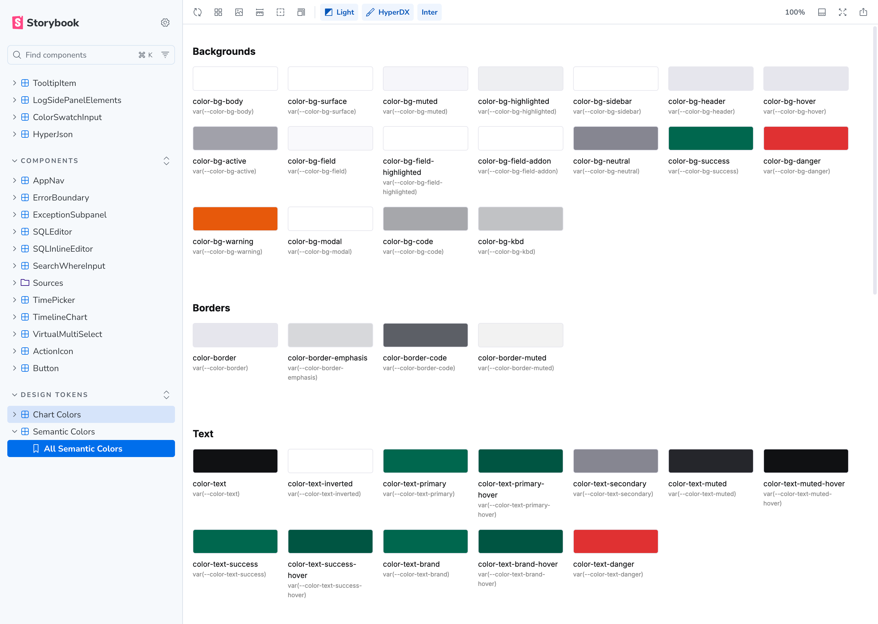
Browse the full set, see what each variable resolves to per brand and mode, spot inconsistencies without opening a stylesheet. Makes PR reviews faster too.
Bonus: the hackathon that didn't ship
Once the two-theme system worked, I got curious. During a hackathon I built three IDE-inspired themes: Nord, Catppuccin, and One Dark, each with light and dark variants. Generated tokens from the source palettes and plugged them in.
Mostly worked. I closed the PR though. Click UI currently supports one theme, and maintaining parallel token sets means checking contrast across every combination. I also don't want to overcomplicate the token architecture right before we adopt Click UI in HyperDX.
One lesson: my first iteration recolored the HyperDX logo per theme. Killed brand recognition. Better approach: light themes get the dark logo, dark themes get the light logo, green wordmark stays untouched.
Each week the ClickStack team does a public demo day where we show what we've been working on. I demoed this experiment in the May 8th, 2026 edition.
The shipping challenge
Merging was the hard part. Bootstrap removal, semantic tokens, theme provider — each PR touched hundreds of files. I tried to keep them small. Some ended up huge anyway, and reviewers had to be patient with me on those.
My public GitHub contributions from when I joined (August 2025) until Managed ClickStack launched in February 2026:
218 contributions from Sep 2025 to Feb 2026
45 commits · 41 pull requests · 33 PR reviews
It's never done
I could already code before AI, but I couldn't have done this in the same timeframe without it. Before, I would have compromised on the solution or waited months for an engineer to have bandwidth. Instead I shipped the system I actually wanted.
But it's not a finished thing. I keep adding agent skills, refining tokens, fixing UI inconsistencies, introducing new patterns. Every week there's a component that needs theming or an edge case nobody thought about. The Storybook docs, semantic tokens, and agent skills mean it scales without me being in every PR, so I get to keep pushing it forward instead of policing it.